



![Cover [EN]](https://investingbot.io/wp-content/uploads/2026/07/cover-en-uuag3.png)
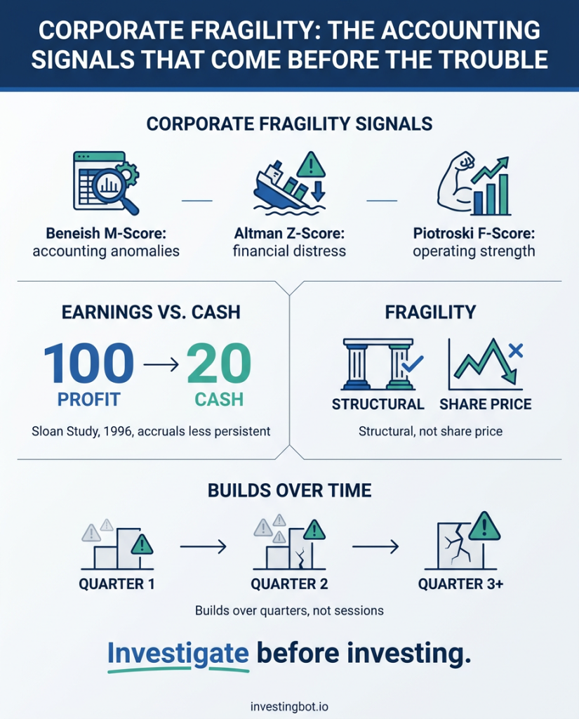
The accounting signals that anticipate a company’s troubles are not a burglar alarm: they are a smoke detector. Three academic models — the Beneish M-Score for accounting anomalies, the Altman Z-Score for financial distress and the Piotroski F-Score for operating strength — read financial statements looking for inconsistencies that usually come before trouble: earnings that never turn into cash, receivables growing faster than revenue, margins thinning while sales rise. None of these numbers says a company is about to fail, or that anyone has done anything wrong. They say something in the accounts doesn’t add up, and that it is worth a closer look before investing.
Fragility is not the same as a falling share price
This is the most important distinction, and the easiest one to lose. A stock can drop 40% because the market has revised its growth expectations: that is a pricing problem, not a company problem. Another company can climb while its financial statements quietly deteriorate, simply because nobody has looked closely yet.
The fragility we are talking about here is structural: it concerns the quality of the accounts and the ability to survive a difficult stretch. It is measured on financial statements, not on charts. And it moves to a different rhythm than the market: it builds over quarters, not sessions.
That has a practical consequence. These indicators are not there to tell you when to buy or sell. They are there to help you decide whether a company deserves a place in your portfolio for years.
The first signal: earnings that never become cash
The income statement is an opinion, cash flow is a fact. It is an accountant’s joke, but it rests on one of the most robust findings in the accounting literature.
In 1996 Richard Sloan published a study in The Accounting Review that became a reference point: he split earnings into the part backed by real cash and the part made of accounting entries (so-called accruals — revenue booked but not yet collected, costs capitalised rather than expensed, and so on). The finding: the accrual component of earnings is far less persistent than the cash component. In other words, a company reporting high profits that never arrive in the bank tends to disappoint in the following periods — and the market, on average, does not price this in straight away.
Hence the simplest and most informative ratio of them all: how much of reported earnings turns into free cash flow. If a company reports a hundred in profit and generates ninety in cash, the accounts tell a coherent story. If it reports a hundred and generates twenty, the question is not whether this is illegal — it almost never is — but where the rest went, and whether that gap is temporary or structural.
Watch out for one case that often causes confusion: when earnings are negative, this ratio cannot be interpreted. Dividing a cash flow by a loss produces percentages that look like numbers but mean nothing. In a loss-making company you look at other things: available liquidity, the structure of the debt, how long before it has to raise money.
Beneish M-Score: a map of the anomalies
The best-known model for spotting “aggressive” financial statements was published by Messod Beneish in the Financial Analysts Journal in 1999. Its construction is statistical: Beneish compared a sample of around fifty companies that had actually manipulated their accounts against more than seventeen hundred control companies, looking for which indicators separated the two groups.
Eight variables came out of it, and they are eight questions about the accounts:
- are receivables growing faster than revenue? (selling to customers who don’t pay promptly)
- is the gross margin deteriorating? (pressure on prices)
- is the share of intangible assets rising? (costs pushed into the future)
- is revenue growing unusually fast? (rapid growth creates pressure to sustain it)
- is depreciation slowing down? (earnings flattered by spreading costs further out)
- are overheads rising faster than revenue? (efficiency slipping)
- is financial leverage increasing? (greater reliance on debt)
- how much of earnings is accounting entries rather than cash?
The model combines them into a single number. Above a certain threshold, a company’s profile statistically resembles that of the companies in the sample that had manipulated their accounts.
This is where the sharpest caveat in this whole article belongs. A score above the threshold does not mean fraud. It means that this set of accounts, read through eight ratios, looks like those of a reference group. A fast-growing company extending payment terms to win market share can cross the threshold without having done anything irregular at all. The model tells you where to look, not what to conclude.
Altman Z-Score: distance from distress (and the limit it was born with)
The second model is older and has a different aim: not the quality of the accounts, but the ability to survive. Edward Altman published it in The Journal of Finance in 1968, combining five ratios — working capital, retained earnings, operating profitability, market value against debt, and asset turnover — into a single score measuring how far a company sits from distress.
It works, and it is still a standard tool today. But it has a limitation that needs to be known, because it is written into the original paper: it was built on a sample of 66 companies, all of them manufacturers, with the smallest ones excluded. That was the industrial fabric of the time: factories, warehouses, plant and machinery.
An economy made of software, services and regulated infrastructure is a different animal. A software company has a very small tangible asset base and a working capital position that the model reads badly. An electric utility or a network operator borrows by design, because it builds assets that will last thirty years: high debt is not a symptom there, it is the business model.
The result is predictable, and we measure it every week. Across our universe of roughly 490 large US companies, 15 in every 100 have an Altman score in the “distress zone”. They are not failing: almost none of them will. It is the model that, applied outside the context it was born in, produces a great many false alarms.
That is why our tool excludes financial companies — banks and insurers, around a fifth of the universe — from both the Altman and the Beneish. In a bank, debt is the raw material and working capital does not carry the same meaning: applying formulas calibrated on manufacturing would produce numbers that are precise and meaningless.
Piotroski F-Score: a report card in nine questions
The third model looks at things from the opposite direction. Joseph Piotroski, in the Journal of Accounting Research in 2000, started from a practical problem in value investing: among stocks that look cheap, some are cheap because the market has overreacted, others because the business really is deteriorating. A low price on its own does not separate the two.
His answer was nine binary tests on the financial statements — profitability, cash generation, changes in leverage, operating efficiency — each worth one point if passed. The score runs from zero to nine. In his study, applying this filter to companies with a low price-to-book ratio produced an annual return roughly seven and a half percentage points above the rest of the group, on the US market between 1976 and 1996.
The strength of the F-Score is its transparency: it is not a score spat out by an opaque formula, it is a checklist. You can read it one question at a time and understand exactly why a company lost a point.
Why none of these numbers is enough on its own
This is the central point, and our own data makes the case better than any argument.
Across that same universe of roughly 490 large companies, taken individually, the indicators flag:
- around 4 companies in 100 with a Beneish M-Score above the threshold;
- around 15 in 100 with an Altman Z in the distress zone.
Take either of those numbers at face value and you end up putting a substantial slice of the market under suspicion — including solid, profitable companies with decades of history behind them.
Cross-reference them instead, and weigh them alongside other signals — revenue quality, interest coverage, market positioning — and the companies that reach a combined threshold of concern drop to around 0.6%: three out of 490. The average score across the whole universe stays very low; only a handful of cases genuinely stand out.
That is the operational lesson: a single indicator generates noise; the convergence of several generates a signal. When three models built by different authors, in different decades, for different purposes all point the same way on the same company, that coincidence deserves attention. When only one points, you are almost always looking at the limits of the model rather than a problem in the company.
What these numbers do not say
It is worth being explicit about the limitations, because they are usually the part that goes unmentioned.
They do not predict failure. They measure conditions statistically associated with past difficulties. Plenty of companies with mediocre scores get through the rough patch and come out the other side; some with excellent scores are overwhelmed by events no set of accounts could have foreseen.
They accuse nobody. A statistical model does not establish responsibility. Accounting anomalies usually have ordinary explanations: an acquisition that changes the perimeter, a change in accounting standards, an exceptional investment cycle.
They look backwards. They feed on published accounts, which means facts that have already happened and are reported months after the event. A recent event — the loss of a key customer, a lawsuit, a refinancing on worse terms — is not in the numbers yet.
They do not apply to everyone in the same way. Beyond financial companies, read them cautiously for fast-growing businesses investing heavily, recently listed ones with a short accounting history, and any company that has just completed a major corporate transaction.
They need to be read alongside the price. A company that shows signs of fragility and that the market has already punished heavily tells a different story from one showing the same signs while trading at all-time highs: in the first case the risk is partly in the price already, in the second it is not.
How to use them in practice
The most useful way to treat these indicators is as an exclusion filter, not a selection filter. They are not there to find stocks to buy: they are there to stop a problem case entering a portfolio without anyone noticing.
A sensible route, in four steps:
- Watch for convergence, not the single number. One indicator out of place is normal; three lining up is not.
- Look for the ordinary explanation before the extraordinary one. An acquisition, an exceptional year of investment or a change in accounting standards explains most anomalies.
- Separate cyclical from structural. In a struggling sector, all the companies show weak numbers: that is not fragility in the individual business, it is the phase the sector is going through. A comparison with direct competitors settles the question almost every time.
- Size the position accordingly. If the investment case still holds after the analysis but the signals persist, the sensible answer is rarely “in or out”: it is a smaller weight in the portfolio.
In summary
- Three academic models read financial statements looking for inconsistencies: Beneish (accounting anomalies), Altman (distance from distress), Piotroski (operating strength across nine tests).
- The simplest signal remains the ratio between reported earnings and cash actually generated: the literature shows the purely accounting component of earnings is the least durable.
- A single indicator produces a great many false alarms: across our universe, 15% of large US companies land in the Altman “distress zone” — a model born in 1968 on 66 manufacturing firms.
- Cross-referencing several signals, the cases worth attention drop below 1%. Convergence is the signal, the single number is noise.
- None of these models predicts failures or accuses anyone: they point to where to look, and must be read alongside the sector, the price and the company’s recent history.
- Use them as an exclusion filter: they are better at avoiding mistakes than at picking winners.
Frequently asked questions
Does a Beneish score above the threshold mean the company cooked the books?
No. It means the company’s accounting profile resembles, across eight ratios, that of a group of companies that had manipulated their accounts in the past. It is a statistical hint inviting a closer look, not a finding of fact. Ordinary explanations — rapid growth, acquisitions, changes in accounting standards — are by far the most common.
Why are banks and insurers excluded from these models?
Because their accounts are a different animal. In a bank, debt is the raw material of the business rather than a risk to be minimised, and concepts like working capital or asset turnover do not carry the same meaning. Applying formulas calibrated on manufacturing would produce numbers that are precise and essentially meaningless.
Should a company showing signs of fragility be sold immediately?
That does not follow automatically, and these tools are not built for timing. They point to a structural risk that plays out over quarters. The more useful question is not “do I sell or not”, but: does the reason I own this company still hold, and how much weight is it reasonable for it to carry in the portfolio?
Do these indicators work on smaller companies too?
With more caution. Smaller companies have more volatile accounts, a shorter reporting history and greater sensitivity to single events: the same models produce more false alarms on them. The original Altman Z also explicitly excluded the smallest companies from the sample it was calibrated on.
Sources and references
The three models cited are published and verifiable in the academic literature:
- Beneish, M. D. (1999). The Detection of Earnings Manipulation. Financial Analysts Journal, 55(5), 24–36.
- Altman, E. I. (1968). Financial Ratios, Discriminant Analysis and the Prediction of Corporate Bankruptcy. The Journal of Finance, 23(4), 589–609.
- Piotroski, J. D. (2000). Value Investing: The Use of Historical Financial Statement Information to Separate Winners from Losers. Journal of Accounting Research, 38, 1–41.
- Sloan, R. G. (1996). Do Stock Prices Fully Reflect Information in Accruals and Cash Flows about Future Earnings?. The Accounting Review, 71(3), 289–315.
The percentages quoted in this article come from our periodic analysis of a universe of roughly 490 large listed US companies, with financial companies excluded from the models that do not apply to them.
This article is for information and educational purposes only. It does not constitute personalised financial advice or a recommendation to buy or sell any financial instrument. The models described are analytical tools with known limitations and do not predict the future performance of any company. Every investment decision depends on the circumstances of the person making it; if in doubt, consult a qualified adviser.